
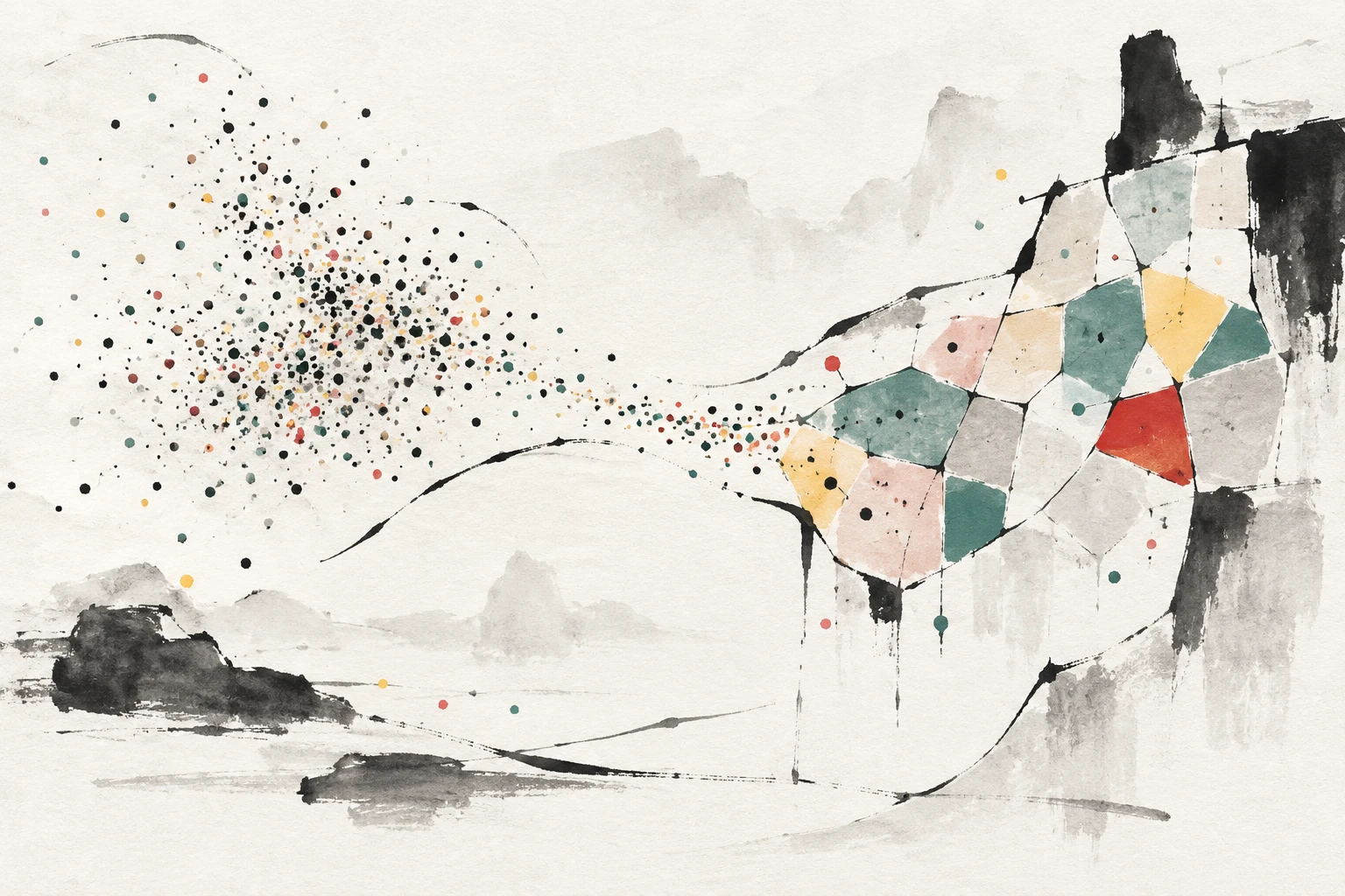
A Histogram Without Rectangles: Can Aperiodic Tiles Change What Scientists See?
A new preprint introduces funbin, a Python package that bins 2D data with arbitrary shapes—from Penrose tilings to national borders—and uses existing astro- and particle-physics datasets to argue that bin geometry can shape fundamental understanding.
Mar 31, 2026
Common 2D histogram tools are built around rectangles. A two-dimensional histogram divides a plane into bins, counts how many data points fall in each, and paints the result. The square is so familiar that it can feel neutral. A new preprint argues it is anything but.
The square-bin problem
2D histograms are a workhorse of modern science. Matplotlib and ROOT, two standard plotting tools, usually offer rectangular bins; hexagonal bins are a common upgrade. The paper says this narrow menu imposes an artificial geometry on data. Nature rarely produces simple four-fold symmetric shapes like squares, and both square and hexagonal grids repeat periodically—translated copies map onto themselves. The author, Igor Vaiman of the Gran Sasso Science Institute and INFN-Laboratori Nazionali del Gran Sasso, frames this as a philosophical mismatch between the microcosm of the plot and the macrocosm of the object being studied: the small world of the visualization and the larger world of the data.
Penrose tiles, pulsars, and country borders
The proposed fix is a Python package called funbin. It is Matplotlib-compatible and accepts an arbitrary set of polygons as bins. The algorithm is straightforward: translate and stretch the polygons to match the data's bounding box; for each data point, find which polygon contains it using a spatial index to avoid checking every far-away tile; sum weights per polygon; divide by each polygon's area to estimate density; and color the polygons with a colormap. Generators can produce Penrose tilings (aperiodic tilings made from a few tile shapes, labelled P1, P2, and P3), aperiodic monotiles (single shapes that tile the plane without periodic repeats), Voronoi diagrams (regions grown around seed points), and map boundaries imported from GeoJSON.
The paper demonstrates funbin on existing public datasets. In a Hertzsprung-Russell diagram from the HYG stellar catalog, Penrose P1 tiles—pentagons, a star, a diamond, and a boat—replace rectangles. The author reads stellar-evolution symbolism into the shapes; this is an interpretive choice, not a measurement.
For gravitational-wave data, the paper rebins the posterior distribution (the inferred probability distribution) of the two black-hole masses from event GW191109_010717, released with GWTC-3. The figure is labelled Penrose P2, while the surrounding text describes the two rhombi of the P3 tiling. The pattern is said to resemble projections of 3D cubes, and a secondary mode appears with a mass ratio equal to the golden ratio—a number the text links to the area ratio of the fat and thin rhombi. The resonance is striking, but the paper does not claim a new physical law.
Another example uses a Penrose tiling on simulated LHC Olympics BlackBox1 jets (the text says P2, the figure caption says P3), plotting the invariant mass of the leading dijet against the η–φ distance (a detector-coordinate separation) between its two jets. The author jokes that a non-standard binning and a potentially buggy implementation could inject new anomalies into the data—an opening for high-energy physics, and also a clear warning about software-dependent results.
A pulsar P–Ṗ diagram (period versus period derivative) from the ATNF catalog uses the turtle shape from the recently discovered aperiodic monotile family. Fermi LAT raw gamma-ray counts around PSR J2032+4127 are binned with the related hat tile; the 0.2–10 GeV map shows diffuse emission and three bright pulsars.
The most theatrical example maps galaxies within 200 megaparsecs from the Biteau 2021 catalog onto Earth's political map. Country borders from Natural Earth become bins, while oceans are subdivided with HEALPix (a standard way to divide a sphere into pixels). The galaxies are weighted by stellar mass—with a mass-incompleteness correction—and plotted in Galactic coordinates. The author draws a Kantian lesson about the map as a frame that structures experience, then speculates about splitting a large national pixel—modern-day Russia—to improve resolution near the Virgo cluster. The tone is playful, but the paper's technical argument is that different bin geometries highlight different structures.
Illustrations, not benchmarks
This is a preprint posted to arXiv, not a peer-reviewed result. The abstract says funbin performs best across all tasks, but the paper offers illustrative examples rather than a quantitative benchmark against rectangular or hexagonal binning. The datasets are existing catalogs, simulations, and posterior samples, so the work does not report a new astrophysical discovery. The paper also acknowledges that funbin may introduce 'interesting new ones'—new problems—while solving old ones. The author explicitly mentions a potentially buggy implementation, and the Hermetic, Paracelsian, and Kantian framing is presented as conceptual rhetoric, not empirical evidence.
Scientific plots are arguments. A bin boundary decides which points are grouped together and which patterns become visible. If arbitrary tilings can be made practical, they could align plots with physical structures—sky maps and geographic distributions—instead of forcing every dataset into a grid. The paper itself notes that non-standard binning can also inject new anomalies, so care matters. The real test for funbin will be independent use, rigorous comparison, and whether it helps scientists see something true that rectangles hid.
Most of us will still make square histograms tomorrow. But the paper is a reminder that even the most ordinary scientific tool carries assumptions. Sometimes the most interesting question is not what the data say, but what shape we force them into before we look.